

Digital marketing is booming, and it can be challenging to find a way to make your brand stand out among the rest. Instead of copying what everyone else is doing, try something different! Sometimes, simplicity is the way to go. When everyone else is charging hard after complex designs, try surprising your audience with a bold pop of color! Monochromatic design works well in certain branding situations, and I’m here to share a few tips on when you should give monochromatism a try on your next brand design!
Monochromatic Design for Marketing
Convey Emotions
People tend to associate colors with certain emotions. For instance, red demands attention. It’s powerful and passionate. Yellow feels positive, bright, and cheerful. Meanwhile, green feels natural, balanced, and comforting. Pink often conveys love or playfulness. If your brand is associated with a particular emotion—or if you’re trying to elicit a specific emotional response—a monochromatic image may help. Check out this Color Meaning & Psychology Guide and poster by GRAF1X. It even has suggested industries and purposes for each color.

Amplify Your Style
On that note, maybe you’re more concerned with conveying a distinctive style more than an emotion. Monochromatic designs can help with that, too. Sticking with a single color allows you to emphasize other parts of your design, brand, or products because colors aren’t overshadowing the overall style or detracting from your focal point. A single color looks clean and uncluttered.

Catch Eyes
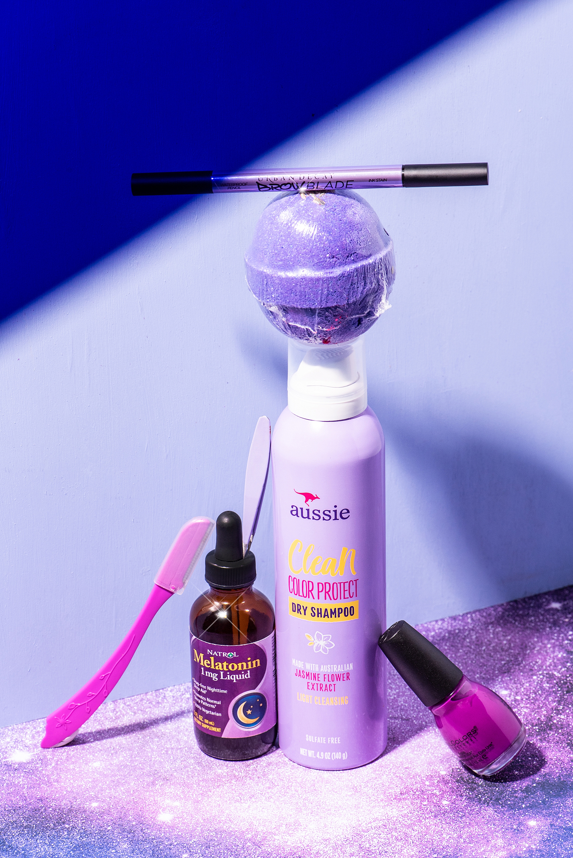
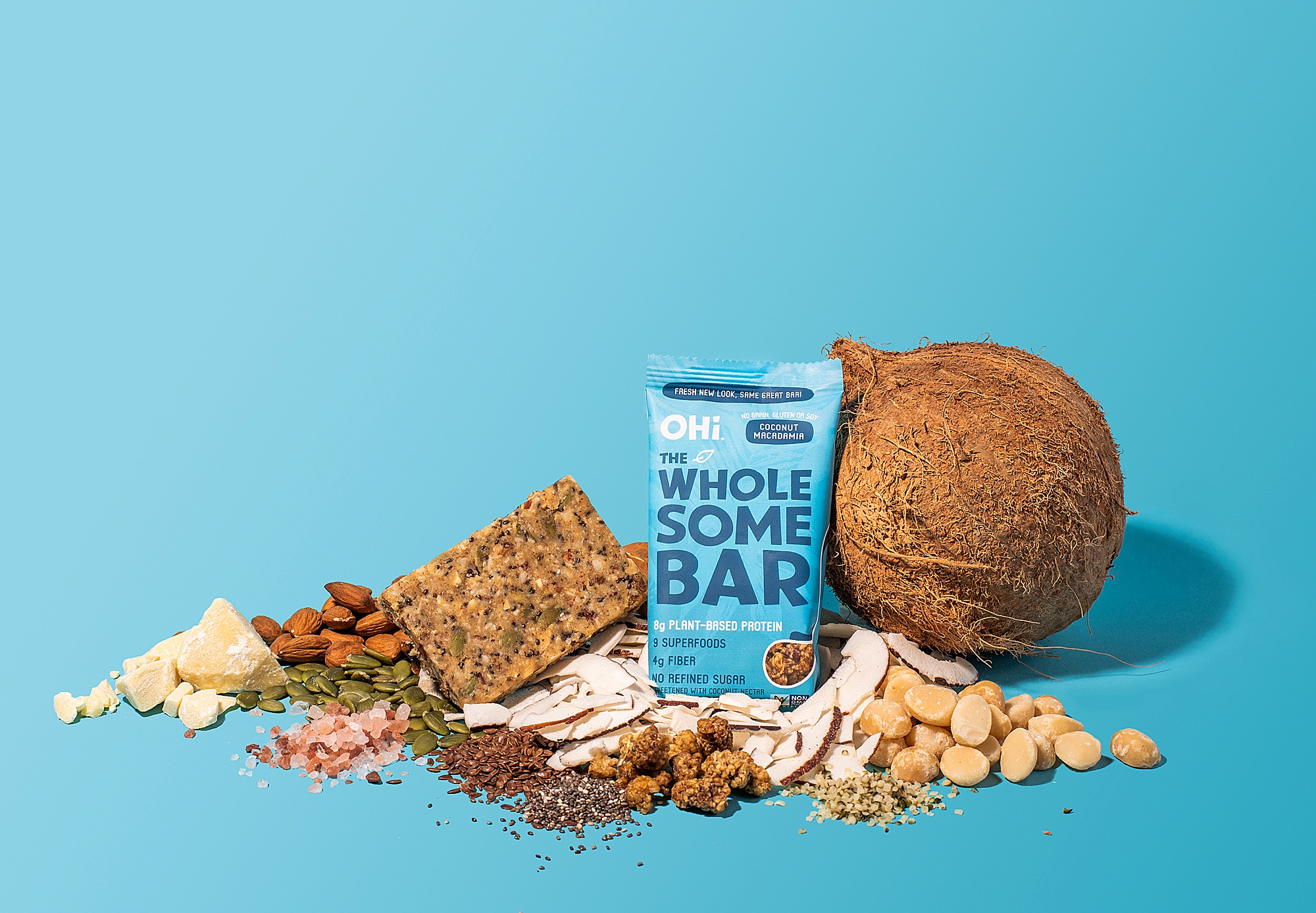
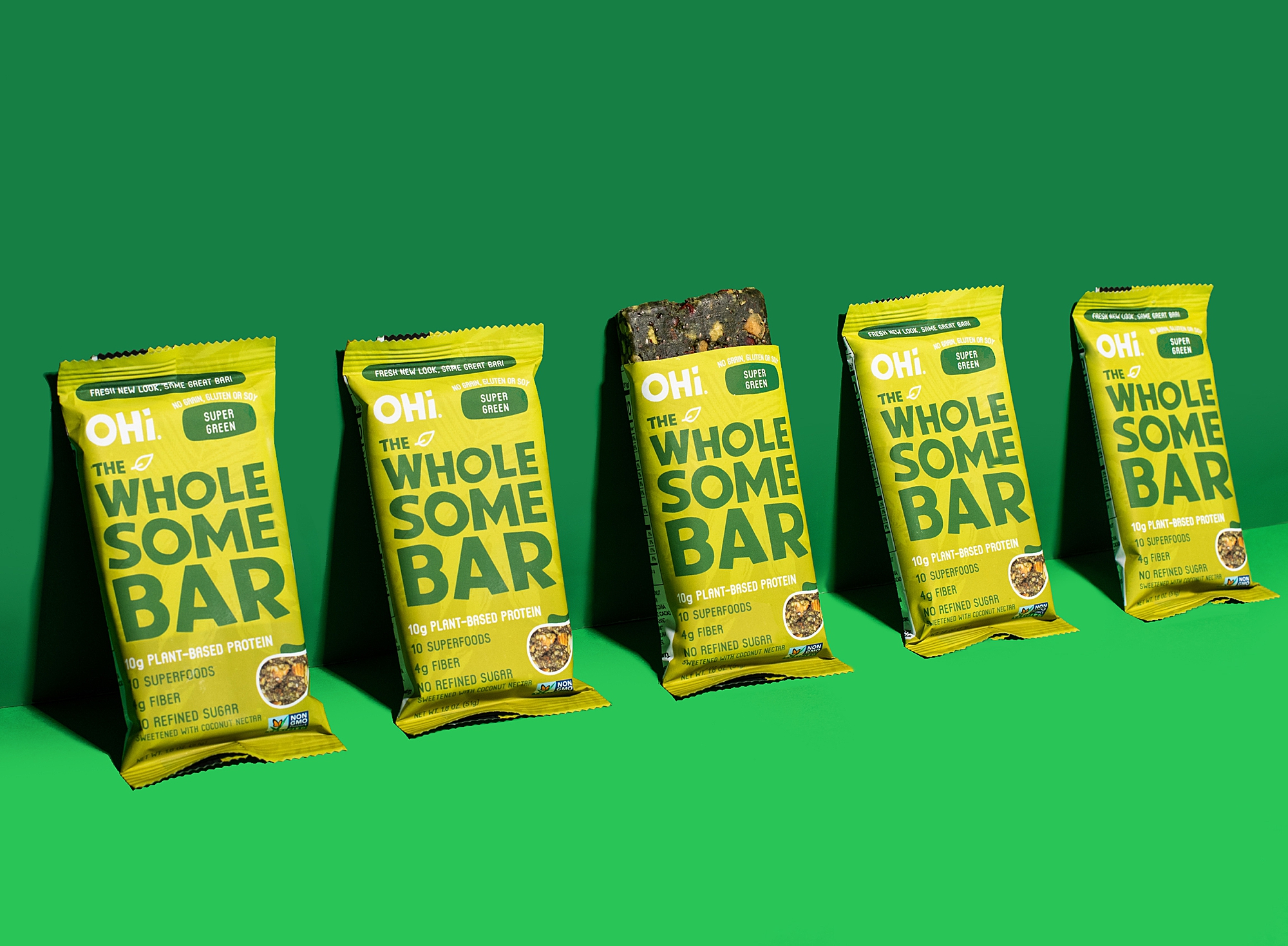
I did a test run just for you! Check out how these sample images just pop. The solid color block fills the screen and demands your attention. Trying to attract an audience? (Who isn’t, right?) A monochromatic design may get the attention you’re looking for.
Enhance Aesthetic Appeal
Isn’t there just something refreshing and fun about these images? Monochromatic designs are alluring and interesting to study. You see the bold color at first, but then you keep dissecting the image to take in every part of the composition—kind of like a subconscious hidden picture puzzle where you have to scan the whole design for details.

Distinguish Different Products
Maybe you need a monochromatic design for practical purposes. Some brands keep the same design format for consistency across their product line, which is a solid strategy! So, using different colors for products with the same label is a visual way to set products apart and help customers easily locate the option they’re looking for.
Memorable Monochromatic Images
The simplicity of monochromatic designs makes your images more memorable. It’s easier for our brains to store and recall a picture with a bold color as opposed to a busier design or one with a neutral color scheme (although I’m not knocking those–there’s a time and place for neutrals as well).

Make Your Social Media Feed Stand Out
Want to spruce up your Instagram grid and get it “on-brand” as quickly as possible? A few monochromatic images may help! They’ll minimize the cluttered look and emphasize your brand colors.

Tone Down a Busy Design
Maybe you intentionally have a busier design that you need to tone down just a bit. Keep the composition the same, but switch it all to the same color scheme. A single color will help your viewer focus on what you’re trying to emphasize in the design.

Make Your Monochromatic Design with Lindsay K Photo
Lindsay is a Los Angeles-based food, product, and commercial photographer. She specializes in Still Product & Food Photography, Lifestyle & Portrait Photography, Stop Motion, and Food Styling. Connect with her here for product marketing!
you said: