In this digital age, marketing efforts span across various media outlets: websites, social media, advertisements, print and promotional materials, product labels, and more. As long as you have quality content and images, you’re good to go, right?
Not quite (but way to go if you have those two aspects nailed down – that’s a huge part of it! 🙌). Setting brand guidelines and developing brand consistency will take your brand over the top and set you apart from the competition.
Put simply, a recognizable style makes you seem legit. Your brand looks consistent, polished, and professional. People can see it and quickly recognize that it’s you. If your brand is highly recognizable, people also tend to deem it trustworthy – an established brand they can count on.
For instance, if you saw a word typed in Product Sans font and primary colors, you’d immediately think of Google branding, no matter what that word was. Their font and colors are iconic.
So, just how do you go about crafting a recognizable style? It’s all in the details!
How to Create a Recognizable Style for Food + Product Branding
Set up your visual brand guidelines.
Be like Google. Define:
- Branding Colors – Make sure to include RGB and CMYK color codes so your colors are true matches every time.
- Typography – Determine your fonts, sizes, and font hierarchy (when to use each font and what size to use for titles, subtitles, and body text).
- Logo Options – Sometimes you’ll want just the large logo; other times you may want a smaller logo paired with your company name.
- Imagery & Other Visual Details
With most of the details, the simpler, the better. The more options and variety you have, the less cohesive it looks. For instance, keep your font options to 1-2 fonts and your color palette between 2-3 colors. It’ll make your life easier.

Define your messaging.
Once you have all the visual pieces together, define your messaging. Come up with a slogan that succinctly conveys what you provide and how it will help the people you serve. It’s a little cheesy now, but Kay Jewelers’ classic slogan is brilliant: “Every kiss begins with Kay.” They aren’t just selling pretty jewelry; they’re selling an experience. Their product encourages romance.
Then, establish your brand tone (expressive, casual, informative, empathetic, emotive, etc.), and hash out your messaging. What are your mission, vision, and goals? What are you all about? Come up with an elevator pitch – if someone asked you about your brand or company, how would you explain it in 30 seconds?
Use a consistent style for all of your photos.
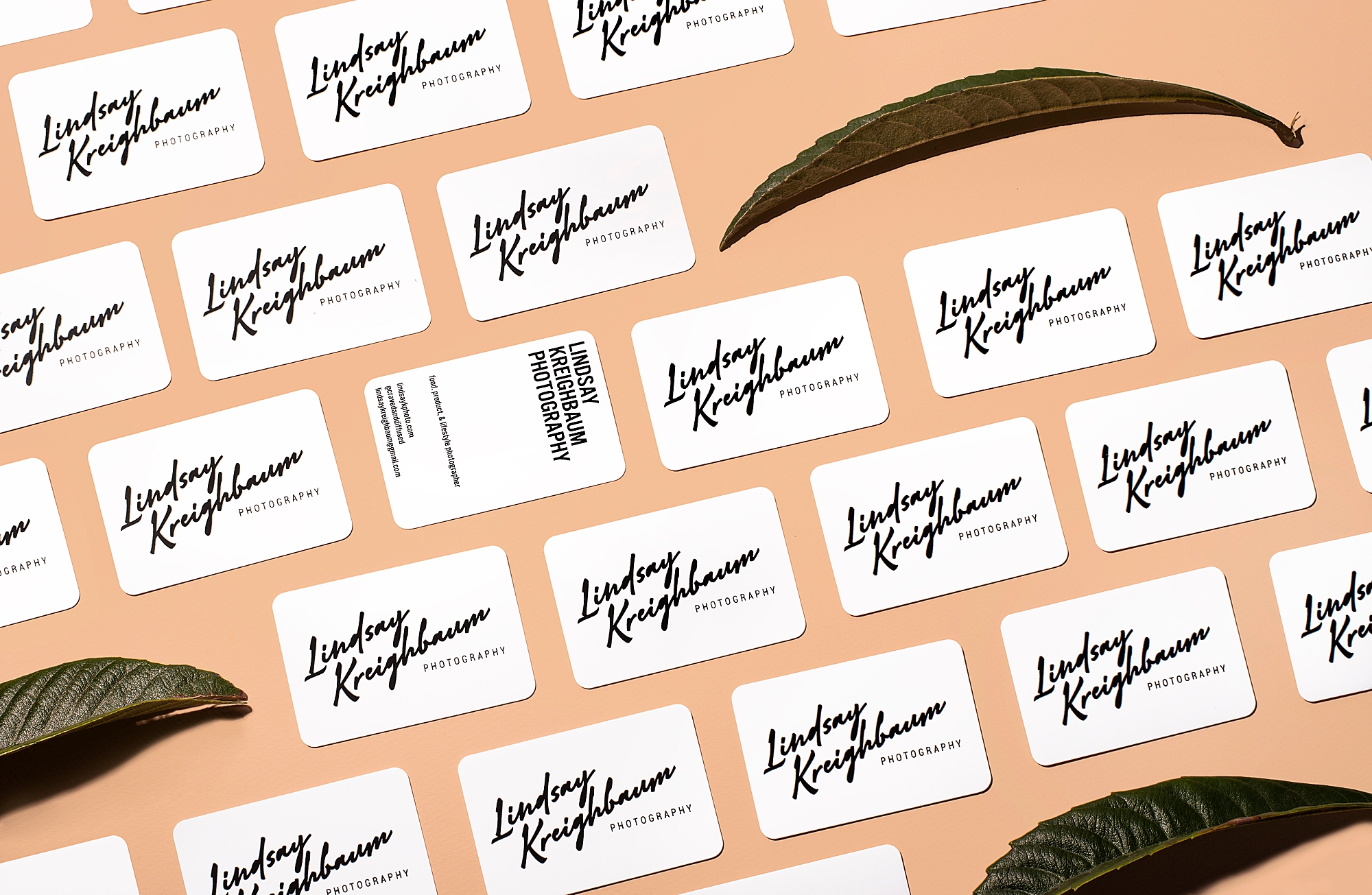
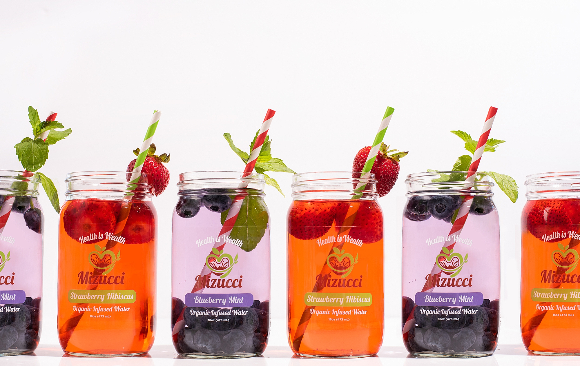
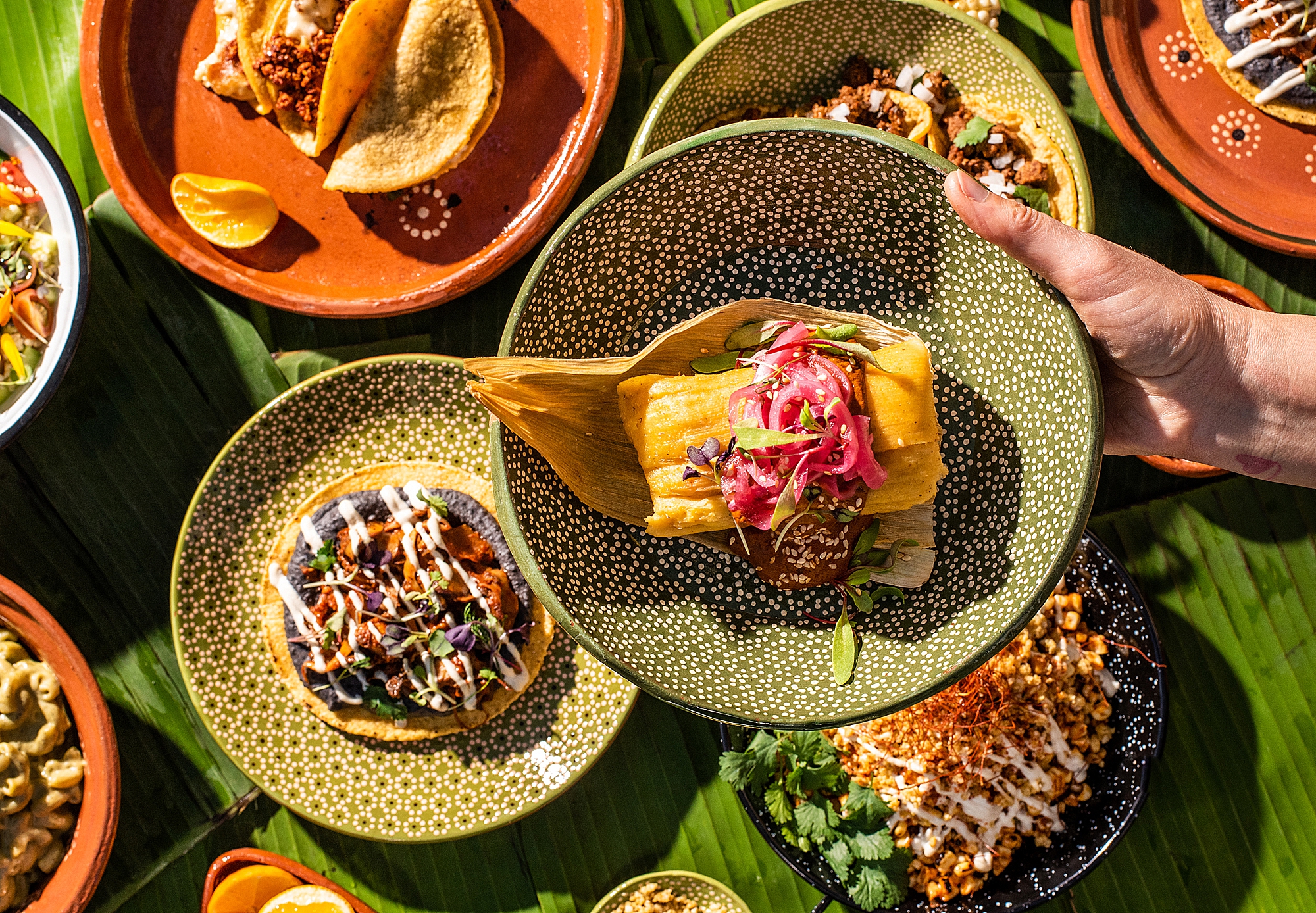
Of course, this is my favorite part of the branding process! I enjoy the challenge of capturing different looks and styles for unique brands, but even my own photography business has its own style. If you look across my website, Instagram, and Facebook, you’ll probably notice that all of my images tend to have a bright, bold, and clean look. I love color! I may occasionally take different types of photos for my clients, but every image I use for my personal brand fits within the same style and look to provide consistency and cohesion.
From muted vintage looks to bold high-contrast styles, pick an image style and stick with it. This oldie but goodie blog article by SitePoint does a great job demonstrating different image styles or “vibes.”


Develop a Consistent Branding Style with Lindsay
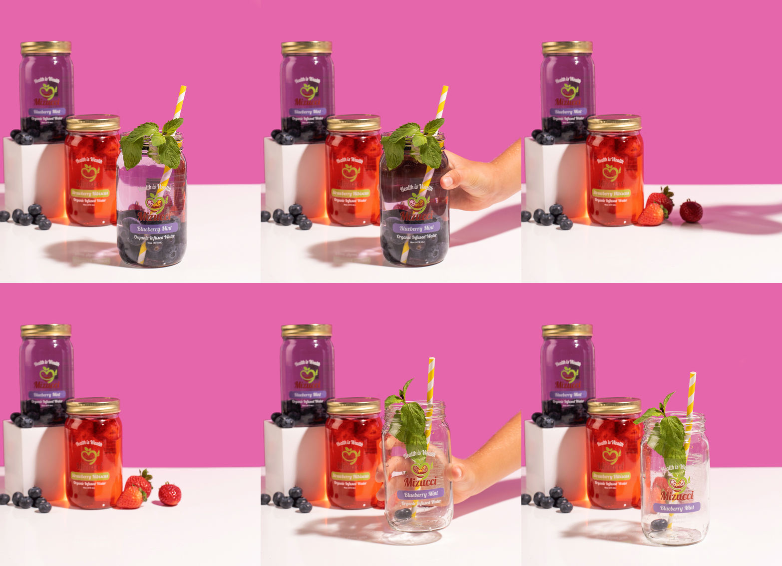
Professionally branded photos go a long way in creating a cohesive style. Plus, you can use your curated collection of food or product branding images for all of your marketing needs. Want a few stop-motion clips or GIFs, too? Let me know, and we can work those in as well!
Lindsay is a Los Angeles-based food, product, and commercial photographer. She specializes in Still Product & Food Photography, Lifestyle & Portrait Photography, Stop Motion, and Food Styling. Connect with her HERE for product marketing!

you said: